
Design is tough. There’s no formula or algorithm capable of delivering ‘the right’ design – at least not every time. Whilst there are rules that we as designers adhere to, it’s still a subjective beast – whether we like it or not! The same could be said for anything involving right brain thinking. The music of Yoko Ono and art of Damian Hirst divides opinion and demonstrates that one man’s trash is another man’s treasure.
In the web space there are elements common to 99% of all websites. We know that, for the most part, they all need images, text and colours. Web design then becomes about how these simple elements are selected, used, stretched, remixed, structured and coded – and this is where things can go wrong.
There are well designed, carefully considered websites that present businesses in the best possible way. And there are eye bleeding, horror show websites, which commit all of the following 7 sins of web design.
1. Text balance
The fonts you use on your website play a huge part in how it presents. Text sizes, line heights and the number of fonts used on a page all impact presentation.
- Size matters. From our experience, 14px to 18px is a good size for standard body text with supporting text such as label and captions often being around 13px to 14px. While it’s difficult to state the optimal sizes for all header tags (main headlines) , H1s are commonly 36px to 50px with H2’s between 36px and 30px and the size decreases as the hierarchy goes down. A good way to determine if your visual hierarchy needs modification is to squint until all the words are a blur. If you’re unable to make any distinctions between the text, you might want to reconsider the sizes being used.
- Line height. Depending on the typeface chosen and whether it’s for body text or headline text, optimal line height often falls between 1 and 1.5x the font size. If you’re either side of that range you’re a sinner.
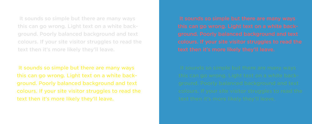
- Colours. It sounds so simple but there are many ways this can go wrong. Light text on a white background. Poorly balanced background and text colours. If your site visitor struggles to read the text then it’s more likely they’ll leave.
- Number of fonts. With a huge amount of fonts available to us it’s easy to want to use ALL of them. We’ve been guilty of using a few too many font’s on sites in the past but we’ve learned the error of our ways. Keep the number of fonts used down to a maximum of 2. More than that and things can start to look messy.
2. Unnecessary Animation
When used in the right way animation can enhance a site design and help engage site visitors. Subtle movements, image hover states and even video can go a long way towards improving user experience and creating something that is interesting to interact with.
When used in the wrong way animation can be a massive distraction and an eye sore. With the advances in web speed and improvements in design functionality it’s tempting for businesses and designers alike to want EVERYTHING animated – but that doesn’t mean that you should. Subtle animations helps bring some life to even the most boring sites but it’s a delicate balance and easy to get wrong.
Our tip, avoid animating site content for the sake of it. Use movement to help bring visitors eyes to a specific area of your site and help create engagement.
3. Crappy images
As discussed in our article The Importance of Good Images, the right images will capture a visitor’s attention, inform them of a particular message and keep them engaged. In a world of short attention spans the old saying ‘an image speaks a thousand words’ is more relevant today than ever before.
Finding images that align with your brand, convey a message and look authentic is not easy. If you’re ever looking for a time vacuum we recommend spending half an hour on Shutterstock. It can be quite soul destroying. There are a lot of great free stock sites that are worth exploring and a few great paid stock sites – but they can get expensive.
Alongside unrealistic stock images, uploading a full resolution unoptimised image is arguably one of the most common sins committed. We often see sites with high resolution images that are better suited to full size billboards than a hand held device. At Start Digital we resize and compress all our images to ensure the site loads quickly without losing quality. Our full screen images don’t exceed 2000 pixels wide and, ideally, should be below 250kb. Whats more, all images should be tagged so that search engines understand what each photo represents. This is almost a post in itself.

4. Cluttered structure
A website has 7 seconds to grab a visitors attention before they leave. Truth! And once they’re gone there’s no coming back. It’s important to very clearly communicate who you are and what you do quickly and with a minimum of fuss. Less is often more but it’s a delicate balance. Either way, if you try to communicate too much or too little then you risk alienating your audience.
Once you’ve captured your visitors attention it’s incredibly important to ensure they can find the information they’re looking for. A clean, simple menu structure and intuitive navigation helps enhance the user experience, creates further engagement and guides site visitors towards the information they need.
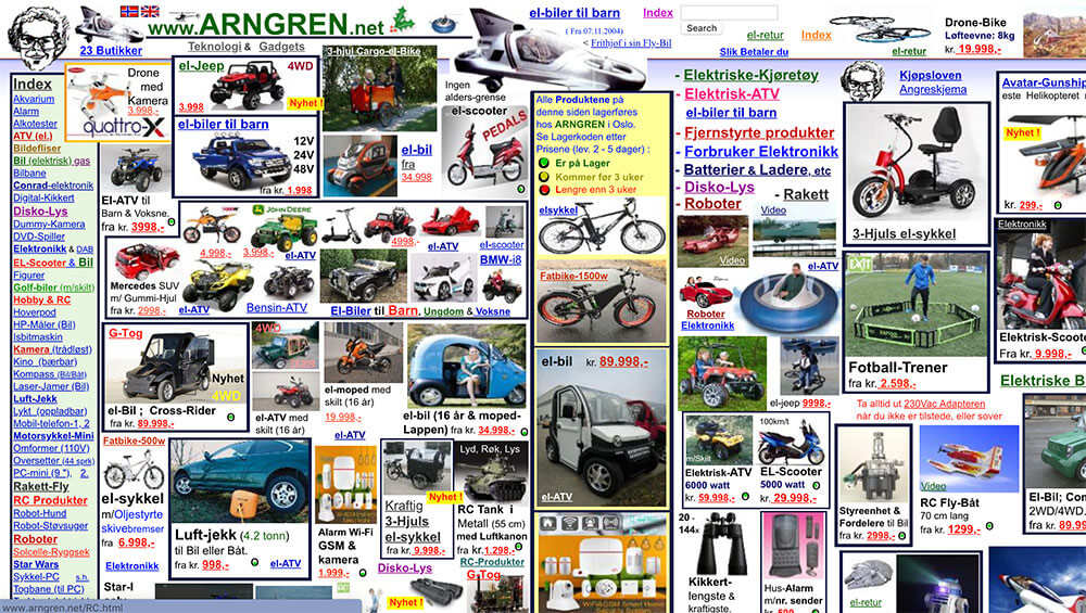
Want to see how not to do it? Check out Arngren…..
5. Pop Ups
‘I love that pop up screen’, said no one ever.
Pop up advertising is still widely used, especially on sites that are marketing products and services. We recognise the temptation for businesses to use pop ups once a visitor has been on the site for a period of time or is trying to leave the site. Our advice is don’t – unless absolutely necessary. No one likes a pushy sales person and we’ve become increasingly savvy to online marketing tactics.
“On average, small business owners need 1319 people to see their popup to get one subscriber who clicks on a link in their emails”
Not only are they annoying but statistics indicate that conversion rates are very low. Even worse is that Google doesn’t like pop ups and they can affect your SEO.
6. Poor use of white space
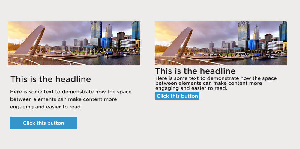
White space is an integral part of all good design but is one of the most misunderstood parts of a websites presentation. Web designers want to use white space, business owners want to fill it and see it as a waste of space.
Whitespace allows your content room to breathe. The space between content makes text more legible, headlines stand out more and navigation more intuitive.
7. DIY Design
For some, the temptation is hard to resist. After all, home DIY work is easy – what could go wrong.
There are so many DIY website platforms, from Wix through to Squarespace and everything in between, making your own website has never been easier. But that doesn’t mean you should. In 2019 Businesses will be judged on the appearance of their website and making sure it’s professional is vital if you’re going to win clients and beat your competitors.
A DIY website builder will get you so far but inevitably your site will look homemade and, unless homemade is your thing, it won’t be something you can proudly show to your clients. Read more about the perils of DIY websites here.
The world of web is better looking than ever and has never been so demanding or competitive. Because of this, no design agency or designer or business should need to ever commit any sin – let alone 7!
If your business is looking for a sin-free website, drop us a line or contact us at 1300 170 908 – we’re nothing but angels here! (Unless someone forgets to stock up on coffee beans…)