
At Start Digital, we’re slightly obsessed with web design. Scouring through the Internet to find website treasures is after all part of our job – and a great way to waste time! While we often use popular sites like LapaNinja and Awwwards, we never limit our exploration to just those sites. In fact, many of our greatest web discoveries have come from spiralling down Google.
We’re big on celebrating exceptional web work and want to share some of our finds. After much back and forth, our team has culled down dozens of sites into the following 6. So without further ado, here are 6 sites to check out this November!
VVV Breda
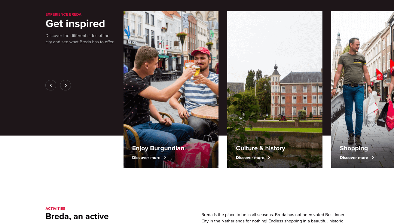
The city of Breda was recently voted as the best Inner City in the Netherlands and their website does an exceptional job at showcasing the city in a fresh, contemporary way. Showcasing the beautiful city, the website incorporates a stunning snap of Breda and “Explore Breda” call to action as the slider. Below that is a sliding carousel that encourages visitors to see what Breda has to offer in regards to Enjoying Burgundian, Culture & History, Shopping, Sport and Family.
Employing simplistic 2 and 3 column layouts accompanied by plenty of white (and in some situations, coloured) space, the VVV Breda website elegantly presents activities like shopping and museums, places to visit such as the Begijnhof monument, events in the city and articles about all things Breda. To break up elements, the Breda site often relies on compositions of St Andrew’s crosses (the city’s identity) placed on a coloured background to bring vibrancy.
For us, one of VVV Breda’s biggest assets is their use of high-quality, authentic images. The images perfectly showcase the city of Breda making the website feel intimate and providing depth beyond words or stock images.
The site is clean, modern and incredibly simple to navigate – everything a website should be! What’s more, it was built on WordPress 🙂
LANDR
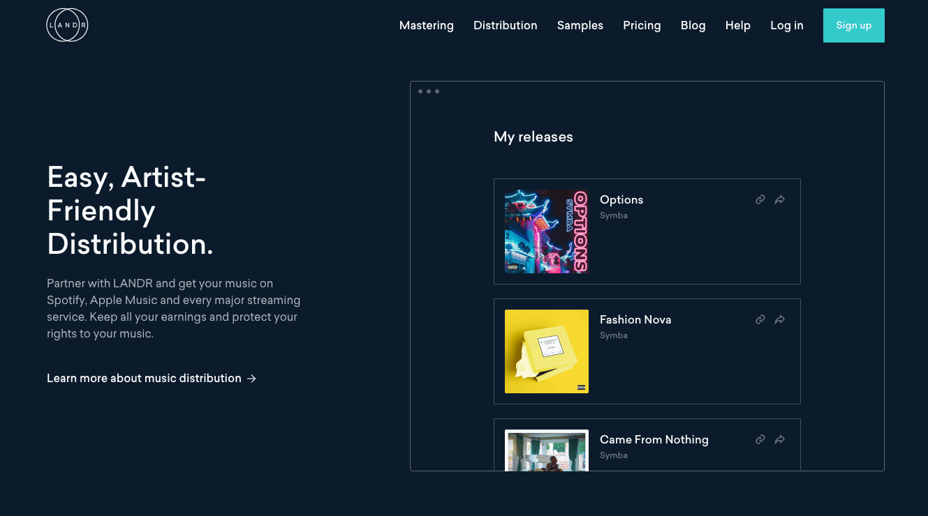
We’re huge music geeks at Start and LANDR ticks the music and design box perfectly.
LANDR is a powerful piece of AI powered music software that assists individuals with creating, mastering and selling their music. Communicating this could be difficult but the headline ‘Create, we’ll do the rest’ captures their offering simply and in five words.
Incorporating a clean header image of a young musician under slightly neon lights (another on trend visual) the dark images contrast brilliantly with the clean white text. LANDR does a perfect job at presenting its top-tier clients underneath the fold. Further down the home page, LANDR presents additional social proofs in the form of quotes from reputable companies such as Fast Company, TechCrunch & Pitchfork.
In a web world where so many sites rely on white as the background colour, LANDR’s heavy usage of a darker colour scheme (largely #0D1B2A) is completely refreshing. The images and photography used sit perfectly in the site and, whilst we’ve not used LANDR, the level of attention and detail in the site suggests the same attention to detail has been given to the software. It’s this presentation and content that helps build the trust required to make a visitor want to learn more.
The LANDR site is completed with the Saliec typeface. Sailec adds a sense of modern sophistication to the site and pairs well with all of the other visual elements.
We’re super excited to see where the LANDR site goes from here. And we’ve just signed up for the trial!
Garage Project
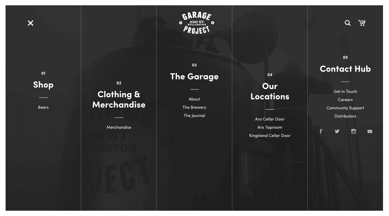
Based out of the Aro Valley in Wellington, New Zealand, the Garage Project is an independent brewery formed by two friends and a brother. Built on Shopify, the Garage Project website is, for us, the discovery of the year. Not only is the site a maze of discovery but we can confirm that, having ‘sampled’ many of their beers their product is pretty amazing.
Once you’ve verified you are over 18, users are met with a sleek homepage that showcases current Garage Project brews. Unlike anything we’ve seen before, the Garage Project menu is next level. A full-screen overlay of their beer, the menu is broken into 5 sections (Shop, Clothing & Merchandise, The Garage, Our Locations and Contact). As you hover over individual sections, the segment presents a new feature image that is related to that section. It’s easy to get a little lost but then, this is a website promoting alcohol, it’s expected.
From their unique layout, light-hearted copy, and use of Sofia Pro to perfectly designed images, we can’t find a fault with the Garage Project website. The Garage Project site design and user experience perfectly echo the design of their products – unique, fun, and engaging. We absolutely love their website (and their Unknown Mortal Orchestra beer).
Femme & Fierce
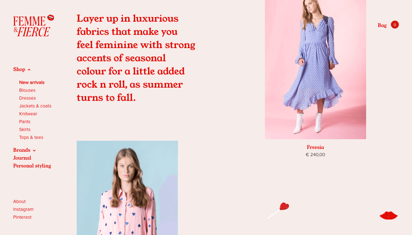
Femme & Fierce is one of the countless websites Muzli has introduced us to. An online retail store catering to strong, feminine, independent ladies who like expressing themselves through bold colours, luxurious fabrics and playful coloured prints, the Femme & Fierce website perfectly embodies their ethos.
Femme & Fierce’s website is out of the box, literally. By using a brutalism framework in their layouts, together with scroll animations, the site presents a bold and fresh vibe all the way through. Rather than adopting the common top bar menu, Femme & Fierce remain true to themselves and applied the sticky menu to the left.
Because the site intends to be fun, Femme & Fierce makes great use of custom effects. The constantly moving site is never boring thanks to the SVG Animations and hovers states that include rotating love heart lollipops, lipstick being twisted and moving arrows. In writing, it sounds distracting but it has been executed perfectly.
Another of the site’s strengths is its stunning imagery. Each image from products, and journal images to the header Tumblr-like visuals, adds depth and thoroughly embodies its brand. Furthermore, we’re big fans of Stephanie, the website’s chatbot which enhances one’s experience by providing users with personalised style and advice at any time.
Developed by creative studio Wonderland, the Femme & Fierce website hits the objective nail right on its head – the site is fun, friendly and encourages sales all throughout ones’ experience. For all of those reasons, Femme & Fierce is a site you need to check out this November!
Affinity
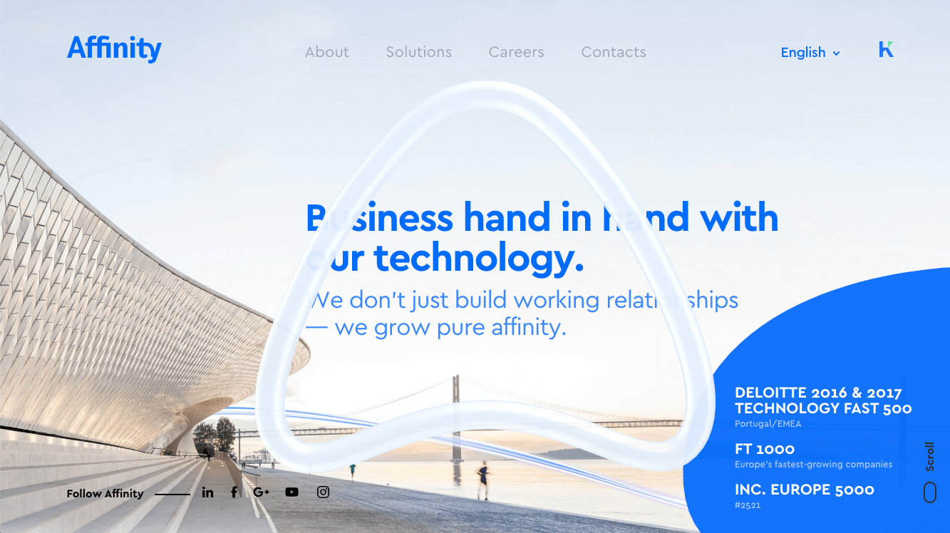
A Site of The Day Winner on Awwwards, Affinity is a Portuguese consultancy company that specialises in Technology and Information Systems. Developed by the creative agency Burocratik, the Affinity site is well deserving of any awards.
The Affinity site captured our attention the moment it loaded. Using a stunning waterfront image, animated Affinity symbol and social proof, the Affinity slider does a remarkable job at immediately building trust and drawing a visitor in. In addition to using on-trend abstract shapes, Affinity also employs a very subtle form of off-grid brutalism in their Job Offers and News & Events section. These small features give the site a unique, modern vibe without veering too far away from the need to present a professional, trustworthy business.
Fonts are often overlooked but they are such a crucial element of any good website. The font, in this case, Cera, oozes modern style. Sometimes seeing the same font through a website is boring but that’s not the case here. All of the size and weight distinctions almost make Cera seem new each time we see it.
We love small details that make an experience more engaging hence why we’re massive fans of this site. By hovering over Affinity’s services, their shape outlines change from blue to white while the SVG Animations used for the Job Offers and News & Events shapes create subtle engagement. Furthermore, scroll animations and transitions make the whole experience smoother than Marvin.
Clearcover
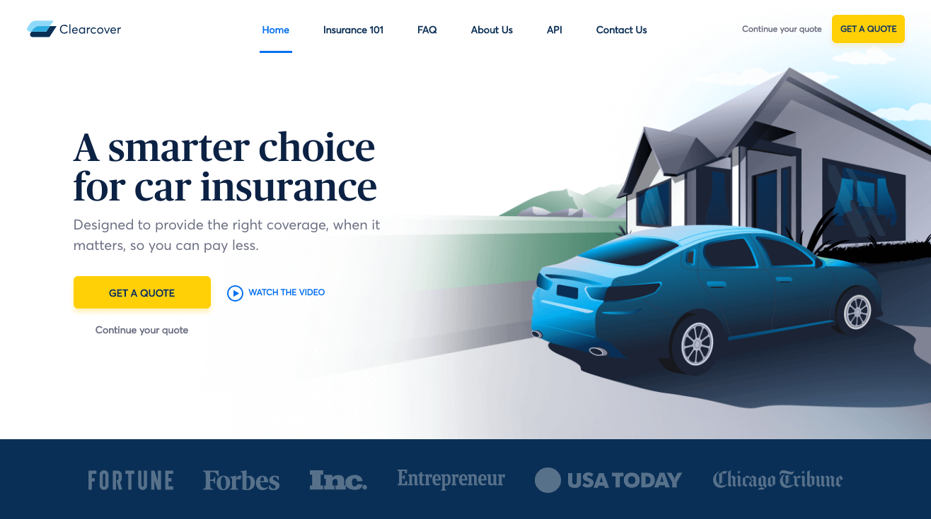
A website for car insurance. Yes, really. Clearcover is a car insurance provider that offers customers better coverage for less money. Developed by their in-house team, the Clearcover website is a simple, corporate website that is far from simple and corporate.
Throughout 2018, we’ve seen the rise of illustration in web design and like many others, Clearcover has leveraged this trend. For some organisations, especially in the corporate sector, illustrations may not align with their brand. However, in Clearcover’s case, the illustrations provide a point of difference and present in a far more engaging way than a stock image could. The contrasting modern and classic style of illustration is eye-catching but doesn’t distract from the key messages.
Clearcover’s use of client logos on the fold helps build trust and the use of the ‘Get a Quote’ call to action against a yellow background button is subtle but constantly there. One of the things we like best about the Clearcover website is its copy. It’s straight to the point, personal and presented perfectly through a mixture of Publico and Averta fonts.
The Clearcover website is a well-designed, corporate site that’s going to remain appealing for a long time.
So there it is, 6 Sites to Check Out in November. Be sure to stay tuned for next month’s roundup.
If you’re a business looking for web design and development, drop us a line – we’d love to help you make your dream website.