Late last year we took a look at some predictions for SEO in 2017. Many of them, especially those around the importance of mobile search, are already coming true with Google announcing in the first week of January an update affecting sites that employ mobile popups or interstitials. Start Digital clients needn’t panic, we’ve got that one covered!
So, now that we’re a few weeks into 2017, it seems like a good opportunity to see what web design trends we expect to see in 2017. Are there big changes afoot or will it be ‘business as usual’? What are the web design trends for 2017 ?
Content is still King.
We have a habit of filling up a website in much the same way as we would fill a newspaper. Ok, so there is a little more consideration given to white space but for the most part we, and by we I mean designers and clients, have a tendency to add sidebars and social feeds and extra navigational elements and more images and sugar, just to make everything seem a little more ‘full’. This is especially true when a site may be low on content.
Recent trends indicate a ‘back to basics’ approach that focuses on the core content. Fear not web designers, we’ll still be needed to roll a site in glitter and create sites that require strong visual appeal but the focus is, and always should be on the content.
We feel that this one may be a progressive thing and take a while for designers and clients to embrace but simplicity key. That being said, creating something simple is difficult! Work that one out.
“Clutter and confusion are failures of design, not attributes of information.” — Edward Tuft
More Creative Fonts
We can’t underestimate the value of fonts in design. In recent years we’ve seen a swing towards using the Google font library, specifically Open Sans and Raleway. These are both great looking, clearly legible fonts, but they’re a little safe and won’t create a strong visual point of difference in 2017.
Google fonts is still very much the go to source for cutting edge web fonts and in recent months we’ve seen an increase in the use of Roboto and Oswald. It’s also easier than ever for web agencies to tap into the vast Adobe Typekit library which opens up huge potential.
More interesting is the subtle shift back to Serif type fonts, which are increasingly popular for website body text and mix well with Sans-Serif headline fonts. If we’re talking double dutch here then check this Font Pairing site out to view some awesome font combinations.
Bright colours and gradients
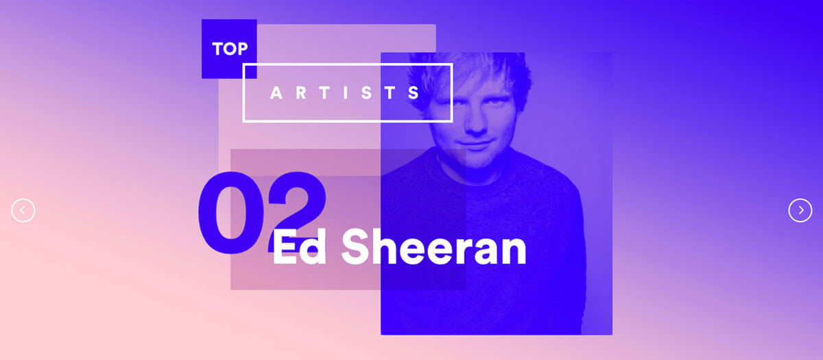
The use of gradients and duotone in images has seen significant growth in the last 12 months. Big players such as Spotify were one of the first to jump on board with the look and it’s a striking, effective way to both showcase images and create some brand synergy with added funk. We’ve applied it subtly on the Start Digital site and, for what it’s worth, we like it.

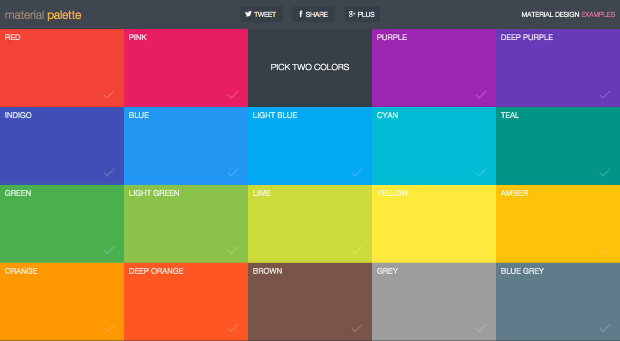
There is also a shift among some design agencies to use bigger, bolder, brighter colour palettes. This obviously works on some sites better than others. Accountants may want to give this a wide berth. Given the popularity of Google’s Material Design and its associated colour recommendation guideline this is one trend that will see significant growth in 2017. As a side note it’s worth mentioning that Pantones colour of the year is the very green, Greenery (15-0343).

Modular Design
Again, this is nothing especially new but is certainly growing in popularity. Modular web design uses grids to layout content. The grid design helps provide a clean, balanced layout by displaying content in boxes of equal height and width. This style of design works well with lots of varied content and great images. We recently used a subtle version of modular design on the front page of the HelpingMinds website but we’d welcome the opportunity to use it more often.
Mobile, mobile, mobile
This has been a constant in every web trend list since 2012 but it’s becoming more important than ever. As Google places greater importance on mobile search and users increasingly use the convenience of voice search tools such as Siri, it’s critical for mobile sites to look good.
Up until this point we’ve relied on platforms such as WordPress to ‘resize’ content for mobile devices. This is a powerful way to achieve great results on a budget but it does have some gaps and can create issues with spacing, font sizes and high resolution images.
There are a bunch of tools coming to the fore that assist with responsive design – Figma is a good example of this – and it will be interesting to see what other tools are created to assist make designing for mobile a little more powerful.
Importantly, we believe very strongly in not trying to recreate the desktop experience on a mobile device. Each platform demands a different approach and we strongly believe that mobile design should be stripped back to core content elements. Again, this is supported by Google and the introduction of AMP.
Authenticity & Storytelling
Ok, so we said Authenticity would play a big roll in web design throughout 2016 and, to an extent it did. As a web design agency we certainly steered clear of the generic stock images that plague some older websites. However, there is a lot of room for improvement.
The best websites have unique, authentic images alongside high quality copy. Every business has a story to tell, and people love a story.
We encourage our clients to tell their story and capture images that showcase their products and services. As noted above, simple is often the most effective method and the quickest path to engagement.
At Start Digital we’d love to see this particular item become the leading web trend for 2017. Creating sites that showcase businesses in the best possible way and engage with users is the goal of any web design company in Perth and our mission is to work with clients that have some clear online strategies and want to position their business for online success.
To learn how we build our sites and how much a website costs in 2017 please browse our blog posts and be sure to drop us a line with any questions.