
The year of 2020 showed huge evolutions in the digital space. With a majority of the population limited to the constraints of their own homes, the world went online. Businesses who had neglected their websites quickly felt the pressure to perform digitally, and those who were already online suddenly had all these new challengers to compete with. Websites became non-optional and innovative designs proved to be more necessary than ever before. Moving forward, we can see how last year’s events have paved the way for the future of web design. Let’s jump into the trends!
Parallax Animation
Parallax scrolling may seem like nothing new, but combine it with the latest advances in 3D animation and you have something that is new. Traditionally, parallax scrolling uses layers of images that move at different rates as you scroll, giving the subtle effect of depth, as if you’re moving closer or further from the object. Adding 3D animation to this scrolling effect adds a whole new level of realism and engagement.
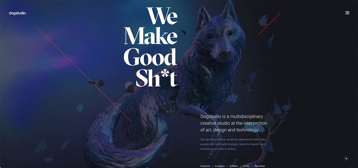
One of our favourite examples of this is Dogstudio, a creative studio based in the US that specialises in immersive branding. Once landing on their homepage, you are greeted by a 3D animated dog who is basically ALIVE. He blinks, breathes, and as you scroll he moves through what feels like a space-time continuum. Dogstudio’s parallax animation almost makes us forget we’re stuck inside, transporting its audience into a virtual world and capturing our engagement.
While most businesses will probably never need websites as extravagant as this example, the basic principles of the parallax animation effect still remain. During times where we can’t experience the outside world to its full extent, having depth and realism in websites can help with the stir-crazy.
Accessibility
2020 was also the year of equality, and this sentiment has not been lost in the digital space. Accessibility is a huge focus for web designers, but what is it? Simply put, an accessible website allows the user to perceive, understand, navigate, and interact with ease. Therefore, an accessible website should be designed so that those with auditory, cognitive, neurological, physical, speech, and visual disabilities are able to use it.
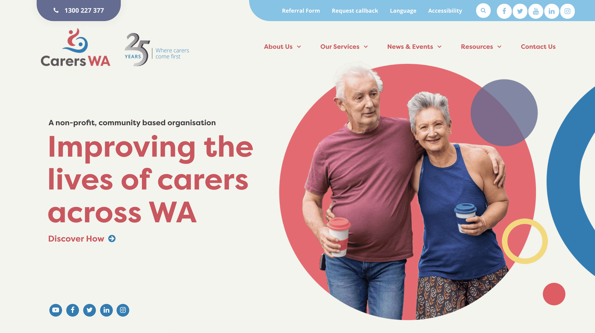
Carers WA is dedicated to improving the lives of the estimated 230,000 family carers living in Australia. Start Digital is proud to have worked with their incredible team on revamping their website and making it accessible in all senses of the word. We chose two vibrant colours which, while complimenting, are also very contrasting, assisting with visibility for the viewer. We also provided accessibility tools, including the ability to adjust the font size and font type, grey-scaling the colour of the site, and underlining links for easy navigation. And that’s not all – we’ve also integrated the website with a language translator, allowing its text content to be translated in over 100 languages.
The beauty of an accessible website is that everyone can benefit from it. The elderly, who have changing abilities due to ageing, people with “temporary disabilities” such as a broken arm, “situational limitations” such as an environment where they cannot listen to audio, or even just viewing websites on multiple different screen devices.
Comfortable Muted Colours
Whether you’re online for pleasure or work, there is no doubt that our screen times have dramatically increased, making eye fatigue a real concern. We started with the classic stark white web design, followed by the cool and suave “dark mode” trend, but these were two extremes of light and dark, and over prolonged periods still caused strain on the eyes. Adventuring into the unexplored “middle” of the colour chart, comfortable, muted colours are finding their way into upcoming web designs. Soft colours such as pastel blues, nourishing greens, warm browns and delicate pinks create less jarring visuals, as well as naturally evoking calming and relaxing vibes.
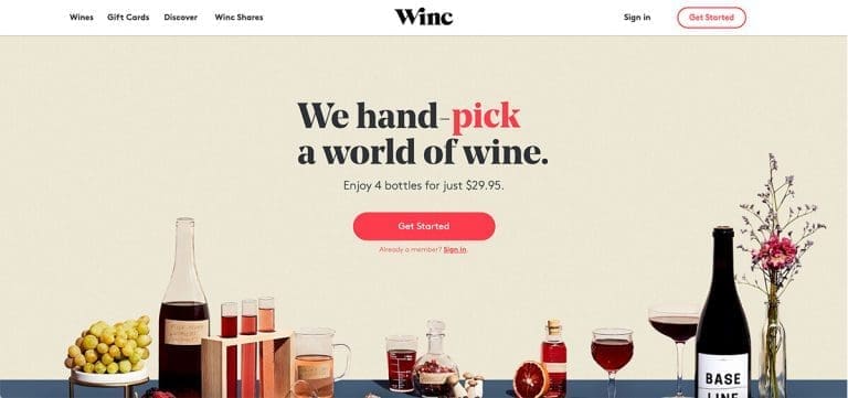
We absolutely love the colour scheme Winc has chosen. This personalised wine club daringly dabbles in multiple shades of cream, blues and corals, which are effortlessly balanced through the use of muted tones. This is further complimented by the desaturated imagery which uses the same muted colour palette. The result; an extremely aesthetic and visually comfortable website, which is a plus seeing as we’ll probably be perusing their wine collection for a while… definitely calm and relaxing vibes ✌
Custom Cursors
Often overlooked, a cursor can be an extremely powerful design feature when it comes to engagement, and the overall user experience. You can’t use a computer without a cursor, let alone a website. While most of us are content with a plain old arrow, (to the point where if we didn’t just point it out to you, you probably wouldn’t have even noticed it right?) when the cursor is changed, it is VERY noticeable.
Epic Days have made a ridiculously engaging website. Yes, they have cool animations and graphics that add to the experience, but the fun all starts with the cursor. The Mickey Mouse glove hand is adorably cute, and the movement of the fingers as you hover over links makes you want to start clicking everything. The little icons that float around with the cursor as you move over the calendar dates are a very nice touch, and don’t get us started on the page flipping function! As if you’re actually flipping pages of a calendar, the Mickey Mouse hand opens up so you intuitively understand to click, grab and flick.
Got to admit, we may have spent a little too long just playing around on this site… Hey, don’t you judge!
Neumorphism
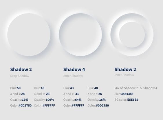
You may have heard of the term Skeuomorphism (it’s a funny word, we know). Essentially this style incorporates established materials and ideas into design in a way that creates a sense of realism for its viewers. Its most notable use was as icons on apps during the early 2010’s. This was later surpassed by the flat design trend, simplifying the icons into basic shapes and colours which, while less realistic, allowed easy recognition and accessibility. Neumorphism has managed to merge the best of both worlds, mimicking realism through strategic drop shadows while maintaining accessibility through semi-flat colours.
So far, this trend has been predominantly used for UI design in app development and on platforms like Dribble, Behance & Pinterest. However, we’re beginning to see the trend slowly increase in popularity across websites. Grammarly has incorporated subtle elements of neuromorphism on their home page.
Retro-Futurism
We’ve all seen trends “make a come back” then disappear again, and often there is very little that changes. Trends usually just get recycled and placed back on the shelf ready for the next time it comes around. Retro-Futurism combines old-fashioned design with futuristic technology to create a multi-layered design style that is (ironically) timeless.
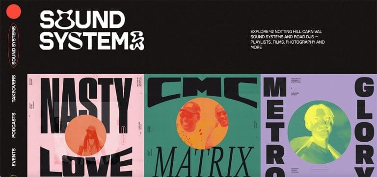
With the hiatus of live music, the Notting Hill Carnival has teamed up with Spotify to go virtual with the ultimate retro-futuristic experience. Since its establishment in 1966, the Notting Hill Carnival is one of the world’s largest street festivals, celebrating the art and culture of the UK’s Caribbean community. Embracing their roots, this website oozes 60’s and 70’s vibes, with psychedelic elements and bright clashing colours. However, it still feels very contemporary, achieving this through use of structured grid layouts, modernised typography and animated elements. The immersive multimedia experience of music and video only further enhances this futuristic throwback adventure. We also appreciate the nod to accessibility at the start of the homepage.
In a time where we’re not really sure what the future will hold, it might be a good idea to take a step back and remind ourselves of where we came from to help figure out where we want to go.
Were you inspired by these latest web design trends? We sure were! If you’re looking to design or update your website, get in touch with us online or give us a call on 1300 170 908.