The Evolution of Web Design

In July of 2015 UX Magazine declared ‘Web Design is Dead’. We’ve heard it all before of course but they raised some relevant points and it was an article that came to mind last week when, over a coffee, a friend of mine mentioned that ‘all websites look the same nowadays’. It’s a good place to start the discussion about the evolution of web design.
In graphic design terms the digital display, as a medium is a relative toddler. If we consider that paper was first used in around 740AD and the printing press has been around since 1440, it would be reasonable to say that we’ve been creating content for paper far longer than we have for digital screens. Yet, pick up a book, newspaper or magazine and it has to be said that there is a common, agreed-upon way to present content that assists the reader in consuming the content for each medium.
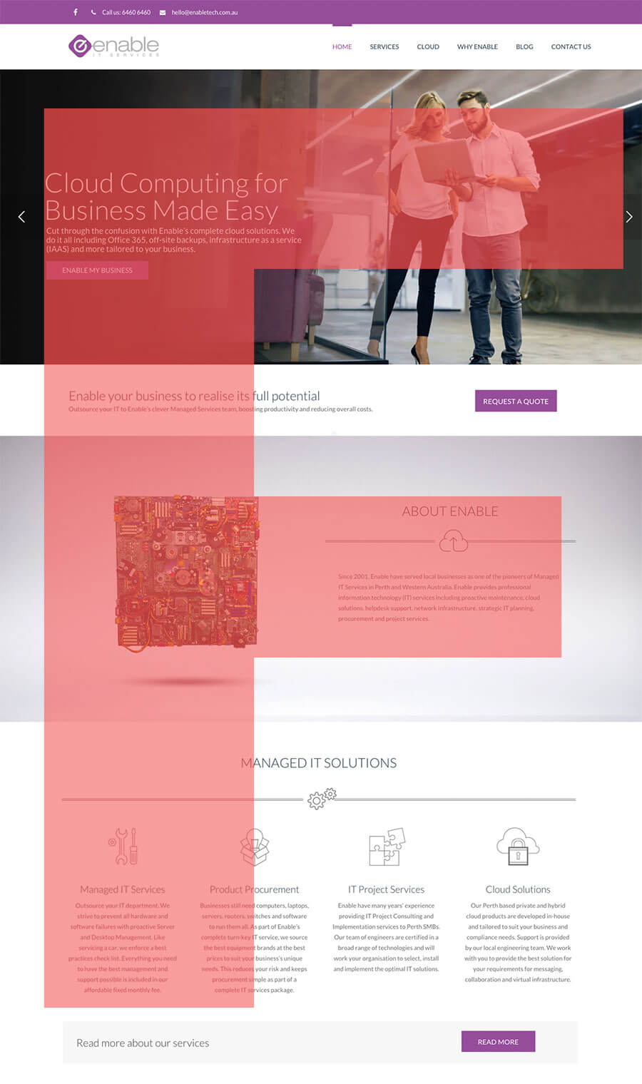
So, lets briefly consider what we know about how website visitors engage with content. We’re told that people read web pages differently. It’s even got it’s own name – The F Reading Pattern. Now before you start to jump to conclusions about what the ‘F’ stands for it’s actually the patterned shape that our eyes follow when first landing on a site. Starting at the top, moving across from left to right, a site visitors eyes then scan down, then across a little more, before continuing down.

We scan web pages – very quickly. So web design has evolved, to this point at least, to accommodate how we engage with our screens – whether they be desktop, tablet or mobile.
What does this mean and what does the printing press have to do with web design templates? In short web design is a young and evolving medium that has to balance a certain expectancy. There’s the history that creates expectations about how we read and engage with content. Then there’s the knowledge that we don’t need to adhere to this old-school thinking – this is technology and we can create something different, something special.
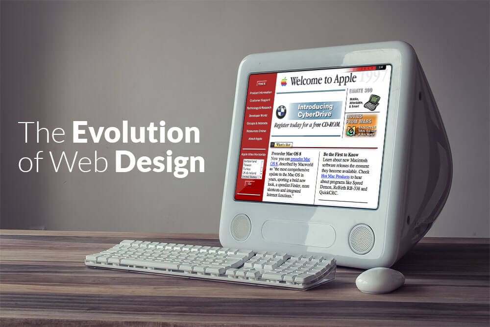
This is where the current web trend fits in and why many sites are using similar layout patterns. It works and we know it works. We’ve got Google Analytics to prove it. That’s not to say it will always be this way. In fact, we know for certain that it won’t be. As device use changes and Internet speeds increase we’ll be able to expand and evolve. No doubt we’ll look back at the current styles in the same way we mock websites from the nineties – limited to 56k modems, bland colour palettes and poor graphics.
So where are we at? Is web design dead?
No but we still have a lot to learn from our users and we’ll continue to evolve our approach as the internet and technology grow.
Will templates, automation and The Grid take over?
Nope. Well at least not in the very near future but they will find their place and continue to provide a simple way for people to build their own website. Our guess is that they’ll represent components of larger sites, perhaps as internal pages at least until they become accepted.
Having some structure to web design patterns and layouts doesn’t have to be boring. Far from it. As web designers it’s our job to find the balance for each of our clients within this framework. Of course, we’re by no means limited to this layout. The sky is still the limit in many ways. However, if they choose, businesses now have a proven page structure to work within and that has to be a good thing.