Design beyond the Fold
A new era for website design.
Those familiar with design principles will be well aware of the importance of keeping your important information “above the fold”. Originally, it was a phrase meant for the space visible once a newspaper was folded, the area a prospective reader would immediately see. There weren’t many different styles/sizes of newspapers (Tabloid, Berliner, Compact and Broadsheet) so this was fairly easy to control in terms of placement of information.
The modern interpretation of this is of course, websites. Now, it means what a reader will see immediately without scrolling. When this rule was initially applied to website design, the monitor sizes that were available didn’t vary too widely. As such, resolution sizes weren’t numerous, so it could still be applied in a broader sense.
Enter mobile phones and tablets. Chaos ensues, like an unexpected musical episode of your favourite TV Show. With the market heaving with all kinds of screen resolutions, where the bloody hell is the fold?
For some platforms, it’s a massive opportunity. Take one of your favourite Social apps, for example. Most research indicates mobile consumers are scroll averse. However, designs like Instagram and Twitter’s news feeds allow users to consume information in bites. Each is a complete enough standalone story on its own that a user can simply move onto the next item.
So what are you to do? You don’t want to lose your most impactful website real estate! The fold still exists, just in a different format. Responsive mobile design can address a majority of these issues, but you still need to be strategic. The placement of your most important info you need to communicate can win or lose you customers.

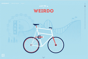
Bike example of parallax
As mentioned in a previous blog post, analytics has indicated not only differences to how information is displayed on websites, but how it is read altogether. The ‘F Reading Pattern’ is certainly influencing design, but it’s not to say that is the way all websites will go. Contrary to the 50 Shades of Shitty Erotica effect, where we suddenly had countless unbearably boring bodice ripper books thrust upon us.
Consider the beauty of Parallax Scrolling websites. They certainly don’t adhere to the idea of keeping above the fold, but some of these designs have been incredibly impactful in delivering their messages. We’re not the lycra donning type, but this cycling website is an excellent example of beautiful Parallax Scrolling that keeps you moving further down to see what’s next!
Communicate with your designer, if they’re a motivated creative and not a full blooded Vulcan, they will flourish with freedom of ideas and you can enjoy life beyond the constraints of the fold.