
The 5 best fonts of 2016
You only need to check out our offices to see that we love typography. Type has the ability to convey so much more than the words it spells out. A great font can help position a website or brand as being casual or formal, modern or conservative, traditional or cutting edge. As such, we have prepared our 5 best fonts of 2016!
Selecting the right font for your website helps give it character and sets the tone for the content. A hand-drawn font can help portray a boutique, fun and personalised approach whereas using a Serif font helps position a brand or website as experienced and classic.
If you’re unlucky enough you may have heard the terms Serif and Sans Serif being thrown around in design meetings. So before we look at the 5 best fonts of 2016 lets take a quick look at the main font categories. At least you’ll know what your web design guys are on about in your next meeting.
Serif
A serif font is one that has decorative lines attached to the stroke. That’s to say they have feet and arms. A serif font is considered easier to read in print than online and, as such, is more commonplace in newspapers and magazines. However, they’re still widely used on the web and help convey a sense of style, experience and class.
Sans Serif
Where Serif fonts work well in print media, Sans Serif is the go-to font for online work. ‘Sans’ means without, so a Sans Serif font is one without the decorative stroke attached. Sans Serif fonts are generally thought to look cleaner and more modern. In terms of legibility Sans Serif fonts are thought to be harder to read than Serif – at the risk of being shot down we’re not sure that it’s much of a big deal nowadays and is more about setting the right tone. Popular Sans Serif fonts include Helvetica, Arial and Geneva.
Display
Display fonts are commonly seen on posters and signs. They’re designed to catch the viewer’s attention and lead them into either reading the body text or discovering more about the topic it’s showcasing. A display font is largely considered to be one that’s used for a headline and should help set the tone for the main topic. It can incorporate Serif, Sans Serif or Script fonts with its main attribute being that its designed to be big!
Script
A script font is now more commonly known as hand lettering – that age old art of using a pen or pencil to write something on paper. Remember that? The hand crafted characteristics of a script font help add a more personalised, human element to a design. One of the main trends for design in 2016 is moving away from the colder, more digital Sans Serif fonts to the use of big, bold hand-crafted fonts that help project authenticity and honesty.
So, now we’ve established a quick overview of the types of fonts available let’s take a look at what we consider to be the best fonts for Perth web design in 2016.
The 5 best fonts of 2016
Proxima Nova

Proxima Nova
We’re huge fans of Proxima Nova here at Start Digital and have used Adobes Typekit to integrate it into many of our Perth web designs. It has a range of weights and styles which give it broad scope across design – allowing it to be used for headline/display text and easy-to-read body text. The character shapes are tall and wide which make it a great font for screen use. Did we mention it also looks cool? Yes, it does.
Roboto
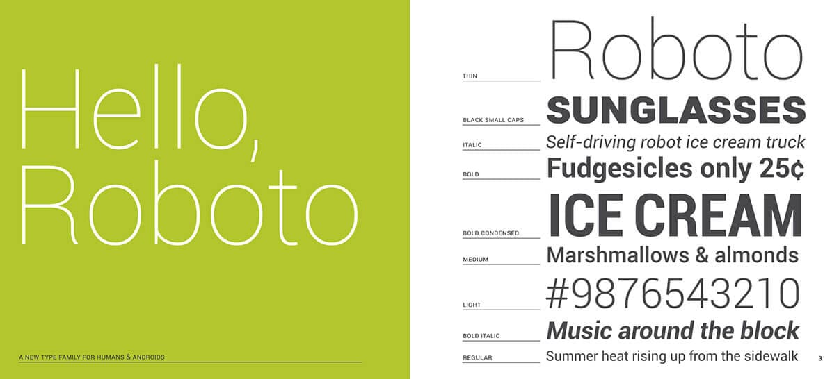
Roboto Font
Roboto is a Google font that is going through a bit of a renaissance right now. So much so that we use it across the Start Digital website. It’s been unfairly called a Helvetica clone but it’s subtle differences make it a font that deserves more attention. Developed by Google as the system font for Android we believe it’s a thinking man’s modern font. Yep, there is such a thing. And this is coming from a business that doesn’t even own an Android device!
Argent

Argent font
We are so in love with this Serif font but haven’t found the right project to use it on yet. Another font with lots of variations, Argent is self described dashing and expressive – we think that nails it. If you’re a Perth business looking to add a little style to your web design please get in touch. We want to use this font!
Wonderlicious
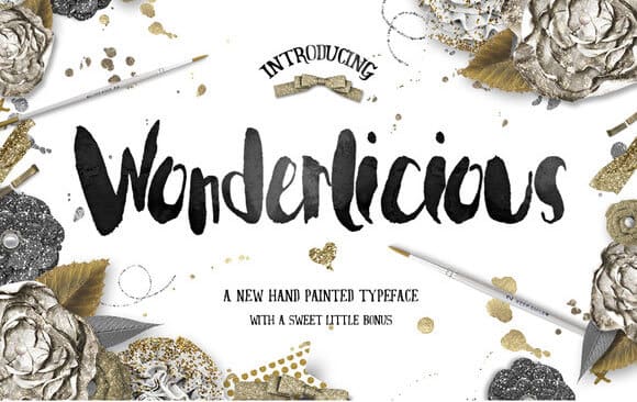
Wonderlicious font
Probably the most used font of 2016. A bold, striking script font, Wonderlicious crops in in countless Instagram quotes and hand crafted postcards. Usually found surrounded by sparkly gold erm, sparkles, it’s a great way to give your posts and images a hand crafted look. We’re expecting this to be superseded by some other script font but, for the time being at least, it’s the queen!
Lulo
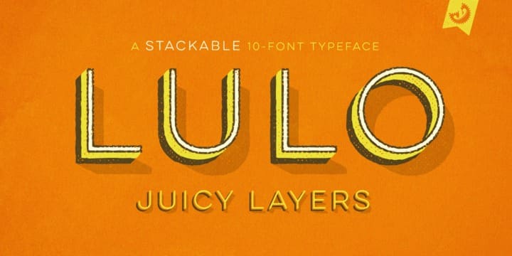
Lulo font
A big, striking display font that’s brilliantly retro and still very now at the same time. We love playing with this font by layering one style over another, giving it depth and making it somehow more fun. Comes as a clean and distressed version which makes it even more flexible. Both are as good as one another.
That’s our 5 favourite fonts to date this 2016! They are prone to change though and have been known to be completely different from one day to the next. Keep an eye out for the fonts we use in our Perth web designs and within our graphic design work for our Perth and Western Australian clients. We love to explore typography and we’re always on the lookout for new ways to freshen up our work.