The Importance of Colour in Web Design
Why is it all Yellow?
The popular Coldplay song I’m sure we’ve all heard and possibly wailed to the stars post-breakup is indeed, Yellow. Martin admitted on the Howard Stern show in 2011 that the keyword of this hit track had nothing to do with colour or any of the other lyrics.
In total juxtaposition to the inspiration for this Blog post’s title, colour is exceptionally meaningful in influencing perception and interpretation. Yellow is an inherently uplifting colour from the warmer side of the spectrum, psychologically linked to joy, sunshine and all those glorious marshmallow adjectives. Confusion abounds when it is often viewed as a happy song, despite the melancholy lyrical theme.
When creating a colour palette for your brand, you must consider your brand identity. Don’t be easily swayed by personal favouritism. You may feel the urge to work only in black, but if your business is a daycare it may be a little off putting for potential customers.
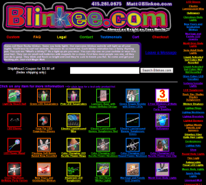
Does it complement your products? If the answer is yes, but you’ve chosen “Rainbow” as a colour scheme, proceed with caution. What’s that you say, you sell rainbow glow in the dark merchandise?
Once our eyeballs are done strobing, it’s easy to see how the implementation of colour was poor in the example to the left. It may well match your range of goods, but it looks like a bad example of a geometric laser show. This is not to say that you can’t use more than one colour, but the use itself is absolutely critical.
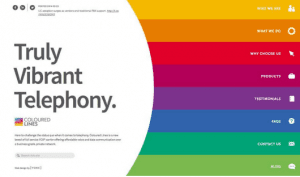
Coloured Lines below, is a perfect example of effective colour use.
Employing the popular colour blocking trend, they have clearly defined their menu whilst accentuating their use of the word vibrant to epitomise their product. It’s easy to look at, easy to navigate and true to their brand.
Let’s get back to yellow. You want this bottled sunshine all up in your website but you’re afraid it’ll look like a gender neutral baby shower?
Secondary colours are here to save the day. There are thousands of combinations with secondary colours that can evoke a totally different emotion when used with the same primary colour. For more inspiration on colour palettes, check out Lol Colours.
Same same, but different
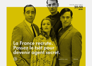
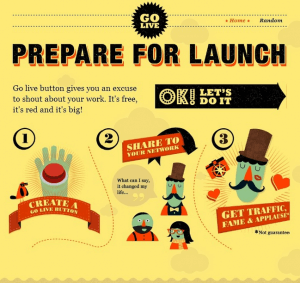
Cast your eye over these two websites on the left, whose primary colour is a shade of yellow. Besides a similar penchant for vaudevillian moustaches, both are clearly different themes.
The first is the official website for a satirical French spy show, set in the 1960’s. The shade chosen is reminiscent of the design in that era and the monochrome photograph is true to the nature of the show. Think French Austin Powers, with less Dr Evil.
The next is more of a whimsical process map to getting your site off the ground. The graphics and banners might look busy, but they’ve only introduced 4 more colours to the palette overall.
But where to start?
If this is all sounding like too much to consider, that’s why we exist. Designers can take your thoughts, ideas and inspirational mind dump to create beautiful brands and sites to match.
There are also plenty of free resources available to get you started like Coolors. More recently we’ve seen the magnificent design service Canva develop a very cool colour matching tool.
Check out some of our visually gorgeous and functional designs in our portfolio!


