People look up your website because they’re checking out your credibility. Simple as that. They want to know they can trust you. New clients will inevitably make your business website their first port of call on the sales voyage so it’s got to deliver, or else it’s a man overboard.
Aside from proudly displaying shiny security badges and limiting those irritating pop up ads, how do you ensure your website looks credible? Enter, the Quality Police.
Quality Control
A website is more than just the sum of all its various features. While some of those features are more obvious than others, in the end they are all critical in delivering a positive user experience and therefore a high-quality website.
Content
- First thing’s first, whatever text is on your website it absolutely must must must get 20/20 in a spelling test. There can be no spelling mistakes in your content. Do not pass Go, do not collect $200. If your website text contains misspelt words how will customers ever find you when the SEO spiders won’t. Those spiders* know how to spell because they have a dictionary and they’re not afraid to use it. Not to put too fine a point on it; have your content edited, twice, three times to ensure there are no grammar or spelling errors. Zero tolerance is the way to go here.
- Relevant, high quality content is rewarded well by users and google alike. Make sure it’s original and purposeful as this can elevate your expertise to thought leader status.
- Video and images. Each section of content should contain images or videos. People like this and if people like it, Google rank it (highly).
Go with the Flow
According to Nielson, 79% of your website visitors will scan it, so make it optimally scannable. How do you do this? Get clever with formatting; use headings, bold your important text and use italics. Keep paragraphs tight and adjectives to a minimum. Where possible use accordions for progressive disclosure. The reader knows all that expert information is there but can opt to refer to it later. Make it super easy for users to find what they’re looking for. Limit the menu options and always include a Search bar. All this makes it better for the user which in turn speaks volumes about your credibility and quality.
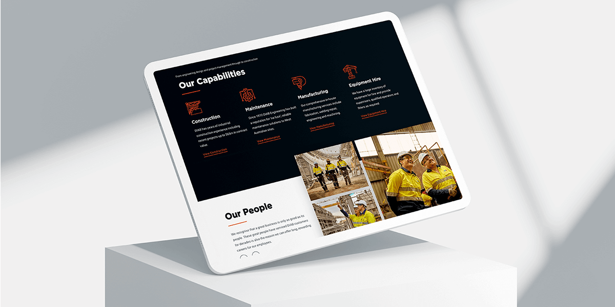
 By leveraging a wide variety of headers, Diab Engineering is an optimally scannable website.
Page Loading Speed
The faster your pages loads, the better. The end. Making sure your website is optimised for performance and search is essential. (Psst here’s a few easy ways to boost your SEO.) Further, choosing a good web hosting service for which you pay that little bit extra, but, like a huge lifestyle brand once told us, ‘you’re worth it’. If your page takes any more than 2 seconds to load then your conversion rate will drop off the edge of the proverbial.
Testimonials
Gold. Diamond. Whatever precious substance floats your boat. Nothing can beat genuine reviews and testimonials left on your website. People are sceptical. They need to see social proof before they commit, sign up and possibly buy. Include well written case studies on your website and in fact you could devote an entire page to their magnificence. A case study tells a story and humans love ‘once upon a time’ especially one that has a happy ending.

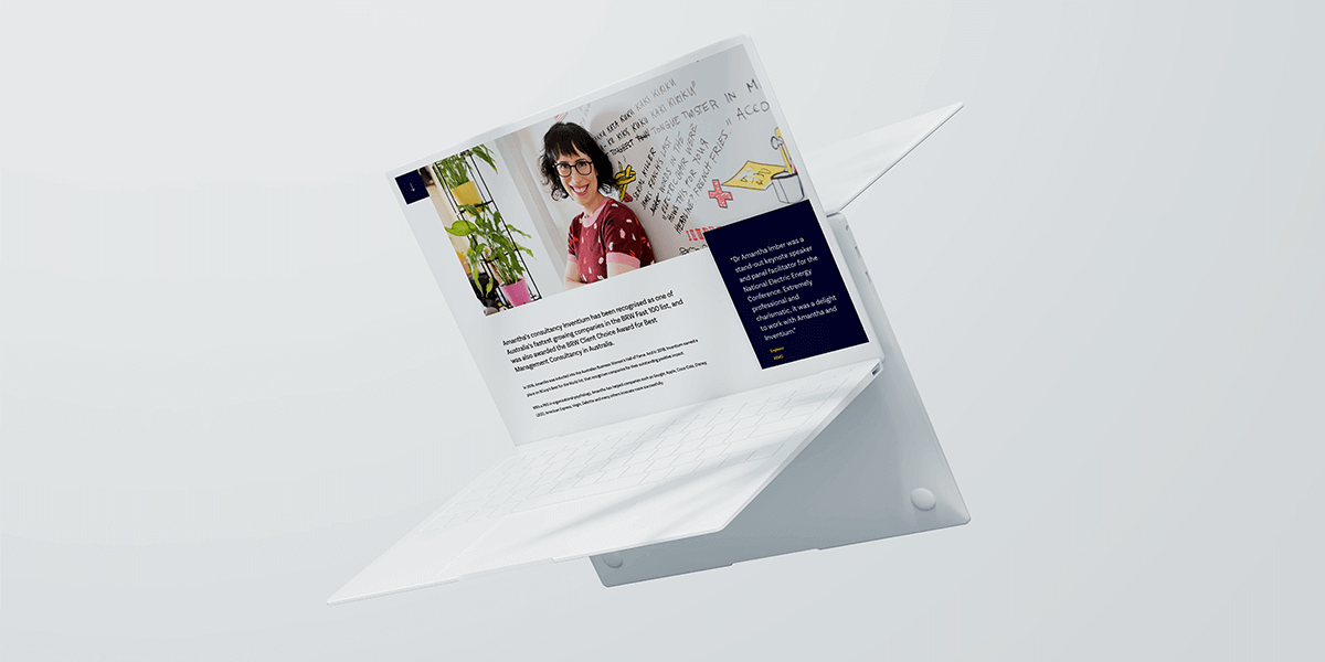
Amantha Imber’s website which was designed and developed by Start Digital, heavily relies upon testimonials and client logos to build credibility.
And Finally!
Your mission is to make your website so incredible that people want to come back and visit. What are you doing today to make this happen?
Start Digital is a Perth-based agency helping businesses stand out online. From beautiful web designs to extensive website optimisation, our team is dedicated to helping our clients achieve the highest quality with their website and digital presence. If you’d like to explore what we can do for your business, please get in touch with Start Digital at 1300 170 908 or send us an online message.
*note, they are not real spiders. These spiders are a tool that crawls around websites to analyse critical data.